После нескольких лет произнесения слов «что, если», «когда-нибудь» и «парень», это было бы нехорошо, Pentaho приняла CSS3 в своем веб-приложении на Java. Потребовалась крупная версия ( Pentaho BI 4 ) с обязательством обновить наш пользовательский интерфейс, чтобы принять более современный вид. Команда разработчиков Pentaho представила часть Apple IOS и часть Windows 7: закругленные углы; эффекты прозрачности; градиенты; отбрасывание тени; текстовая тень; и внутреннее свечение; все они созданы с использованием CSS3, но при этом изящно деградируют для менее функциональных браузеров Это единственное решение принять CSS3 позволило реализовать этот новый облик за недели, а не за месяцы.
| Старый: | Новое: |
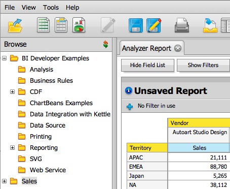 |
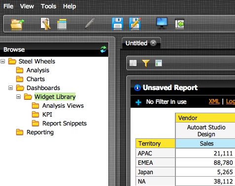 |
Большой скачок в CSS3
Помимо личных желаний, статистики использования браузеров и множества других скучных факторов, наше корпоративное решение перешло на CSS3. Достаточно сказать, что время было для нас подходящим; Преимущества перехода на CSS3 по сравнению с тем, как мы работали в прошлом, дают огромное преимущество.
При нашем традиционном подходе выполнение этого обновленного вида потребовало бы ручной нарезки изображений и кропотливой работы с разработчиками, дизайнерами и менеджерами. Типичное упражнение по скинингу прошло примерно так:
- Дизайнер создает макеты.
- Дизайнер представляет макеты программисту, у которого быстро развивается сердечный приступ.
- Программист сидит с дизайнером, чтобы показать, как именно все должно быть нарезано.
- Некоторое время спустя Дизайнер поставляет десятки (если не сотни) срезов изображений.
- Programmer was wrong about some areas, asks the Designer for different slices.
- Programmer then applies these images in the code, having to construct complex HTML and CSS to match the mockups.
That’s one iteration, but come on, it’s never done at one! The CEO’s going to get his hands on a development build and change his mind (hi, Richard!) — “The whole thing needs to be lighter and less rounded.” More slicing. “That glassy effect needs to be a bit more opaque.” More slicing! And you’d better hope you have your image names and locations straight.
Every time you go through this process, your willingness to make more adjustments approaches zero. That’s the sort of compromise, born of pain, which really screams for new technology. Thankfully, this old workflow was completely avoided by our adoption of CSS3.
The new theme for the Pentaho BI 4 release, excluding icons, contains less than a dozen images. Most of these are for small accent items like splitter grabbers and scrollbar arrows. No more slicing up Photoshop mocks! It’s for real.
Since the vast majority of the new look was constructed by stylesheets, iterations among the graphic designer, programmer, and product owner were very short. This quick turnaround time was extremely valuable, allowing the kind of experimentation and real-life product use that mock-ups alone can never provide.
For instance, our first revision had a largely transparent button panel at the bottom of our dialogs. This looked great in the mock-ups, but in practice there was a huge problem: You can’t control the position of centered dialogs when a user’s resolution isn’t fixed. This led to buttons from behind the dialog lining up with the dialog button bar, which made them appear to be disabled dialog buttons! There’s just no substitute for actual product use when you’re debugging a design.
Put your HTML on a diet
Abstracting the entire layout to CSS also allowed us trim down the size of our HTML files. This resulted in faster application load time and better performance. Take a look at the tag soup for rounded buttons from our previous releases:
<table border="0" cellspacing="0" cellpadding="0" class="roundedbutton" id="okButton">
    <tbody>
        <tr>
            <td align="left" style="vertical-align: top"> </td>
            <td class="roundedbutton-slice" align="left" style="vertical-align: top">
                <div class="roundedbutton-label roundedbutton-label-label">Open</div>
            </td>
            <td align="left" style="vertical-align: top"> </td>
        </tr>
    </tbody>
</table>
And now here’s the code for the new button:
<button class="pentaho-button"/>Open<button>
It looks much better when rendered, too:
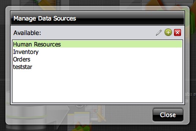
Our tab panel has gone from over fifty lines of nested tables to ten lines of DIVs and SPANs. It’s been my team’s collective development experience on this and other projects that the less table structure a browser has to deal with, the faster the page will feel to a user. In a complex application like our User Console (which mimics the feel of a desktop application), the combined reduction in HTML has a large positive impact on browser responsiveness. We’re not even close to trimming out all that we can, but at least now we have the ability to do it.
Alpha gradients with RGBA
We’re also making heavy use of the ability of modern browsers have partially transparent colors (RGBA). The new default theme for Pentaho BI 4 is highly transparent or «glassy.» This look allows administrators to easily change the feel of the interface by changing the background image underneath. Take a look at the following screenshots. Both are using the same theme, but with a different background. I think you’ll agree the results are compelling:
Standard look:

With new background:
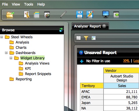
Dealing with the down-side
Of course, there’s a flip-side to every coin, and all was not completely rosy during development. That scourge of Web development — Internet Explorer — threw a wrench in our plans, and as usual, IE compatibility was an exercise in compromise. Even taking IE6 completely out of consideration, there were still problems. We first had to accept the lack of rounded corners with IE 7 and 8. Gradients and partially transparent elements which were at first constructed with ActiveX filters had to be replaced with image slices. ClearType fonts look terrible on top of filtered elements; thankfully, though, IE9 supports some of the CSS3 styles, most notably RGBA and border-radius.
Another area of compromise was with style duplication. While we’ve taken great care to avoid it where possible, in some instances we had no choice due to CSS3’s lack of inheritance. It would be impossible to combine «drop-shadow» and «inner-glow» classes as they’re both defined with the «background» property; the last one defined will win. This leads to classes with names like «drop-shadow-w-inner-glow,» where the styles from the two are duplicated and combined.
There are some server-side solutions to the inheritance problem which add a meta-layer on top of CSS and output the calculated results. We may investigate these at a later point; in addition to providing inheritance, they can output browser-specific stylesheets free of hacks and the namespacing we’re using today. Another benefit of this server-side processing is that we could perform neat tricks like increasing the contrast and shifting the hues of the color palette on the fly.
Is it time for you to switch to CSS3?
If your project hasn’t upgraded to CSS3, I highly encourage you to analyze your usage statics and make the move if you can. The benefits to us were: faster implementation, quicker (and therefore more frequent and productive) iterations, better browser performance, and reduced cost. Any negative factors we thought of couldn’t outweigh these. That mythical “someday” has finally arrived, and it feels great to look back on.
Nick Baker is a lead programmer for the world leader in open source business intelligence, Pentaho Corporation. He has over 12 years experience as a Java and Web Developer with expertise on using cutting-edge technologies to deliver compelling user interfaces.