Добро пожаловать в заключительную статью из серии о моем опыте разработки с AngularJS . Я изучил его концепции, ударился головой об стену и наконец приручил его, чтобы создать для клиента функцию «Моя панель инструментов». Для предыдущих статей, пожалуйста, смотрите следующее:
Последней милей разработки функции My Dashboard было немного оживить и улучшить внешний вид. Мы наняли дизайнерскую компанию, чтобы придумать новый внешний вид, и они пошли на работу. В течение недели мы встретились с ними, и они представили несколько разных вариантов. Мы выбрали тот, который нам понравился больше всего и пошли на работу. Ниже приведены скриншоты, которые я использовал для реализации нового дизайна.
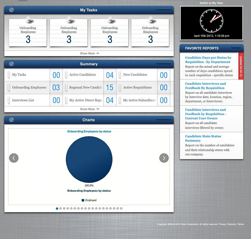

Сначала я подумал, что реализация этого дизайна может потребовать немалых усилий, поскольку похоже, что он использует пользовательские шрифты. Это правда, что мы могли бы использовать CSS3 @ font-face , но я знал, что может потребоваться некоторое время, чтобы найти правильные шрифты с соответствующими лицензиями. Когда я получил скриншот ниже, я был рад видеть, что все шрифты были безопасны для Интернета.
Элементы дизайна
В этом новом дизайне есть ряд элементов, которые мне пришлось создать. Например, если числа были только одной цифрой, мы должны были добавить к ним начальный ноль в итоговой полосе. Другие элементы дизайна, которые нам нужно было реализовать, перечислены ниже:
- Фоновое изображение, которое заполнило страницу
- Исчезать до белого на заголовках сводных виджетов
- Адаптивная сетка для сводных виджетов
- Предоставить цветной фон для нечетных строк в сводной сетке
- Добавьте группу «Показать больше» в нижней части задач, сводок и отчетов, когда есть еще элементы для отображения
В дополнение к этим элементам, было немало работы, чтобы соответствовать новым цветам, шрифтам и теням. Я реализовал все это, используя CSS3 (border-radius, box-shadow, box-size, linear-Gradient) и множество проб и ошибок. Чтобы использовать лучшие шрифты на разных устройствах, я использовал CSS-Trick’s Font Stacks .
Новый Фон
The new background shown in the screenshots above has a light source in the middle of it. Therefore, it’s impossible to tile/repeat it across the page, because it’s not uniform. To make it work, I used a 1024 x 768 image and CSS3’s background-size: cover. For more information on background-size, see SitePoint’s How to Resize Background Images with CSS3. This worked great on smaller screens, but we noticed some issues on 30″ monitors. Therefore, we ended up getting a new repeatable background and stopped using background-size.
LeadingZero filter
For the first leading zero feature, I wrote an Angular filter. I put the code for this in filters.js:
filter('leadingZero', function() {
    return function(input) {
        if (input.length === 1) {
            return "0" + input;
        } else if (input.length > 2) {
            return "+99";
        } else {
            return input;
        }
    }
});
This filter is used in the HTML template as follows:
<div class="summary-value">{{widget.value | leadingZero}}</div>
Text Fade Out
To implement the fade-to-white text in summary titles, I started with this tutorial. I quickly discovered that it worked best for vertical text blocks and not for horizontal text. Then I found Text Ellipsis with Gradient Fade in Pure CSS, which uses :after to position a block over the text that fades to white. Since the title is not the right-most element (the numbers are), I had to figure out the best positioning that worked cross-browser. Below is the CSS I used to implement this feature:
.dashboard .summary-title:after {
    display: block;
    position: absolute;
    right: 66px;
    top: 5px;
    bottom: 5px;
    width: 30px;
    background: -moz-linear-gradient(left,  rgba(255,255,255,0) 0%, #fff 20px); /* FF3.6+ */
    background: -webkit-linear-gradient(left,  rgba(255,255,255,0) 0%, #fff 20px); /* Chrome10+,Safari5.1+ */
    background: -o-linear-gradient(left,  rgba(255,255,255,0) 0%, #fff 20px); /* Opera 11.10+ */
    background: -ms-linear-gradient(left,  rgba(255,255,255,0) 0%, #fff 20px); /* IE10+ */
    background: linear-gradient(to right,  rgba(255,255,255,0) 0%, #fff 20px); /* W3C */
    filter: progid:DXImageTransform.Microsoft.gradient( startColorstr='#00ffffff', endColorstr='#ffffff',GradientType=1 ); /* IE6-9 */
    content: "";
}
Responsive Grid
To implement the responsive grid of summary widgets, I started with Codrops’ Responsive Full Width Grid Tutorial. This proved to be a great model and I used the following CSS to position all the <li>’s appropriately. In the code below, .summary-item is the class on the <li> elements.
.dashboard .summary-item {
    border-right: 1px solid #d1d1d1;
    border-bottom: 1px solid #d1d1d1;
    /* put the border on the inside of the box */
    -webkit-box-sizing: border-box;
    -moz-box-sizing: border-box;
    -ms-box-sizing: border-box;
    box-sizing: border-box;
    font-family: Constantia, "Lucida Bright", Lucidabright, "Lucida Serif", Lucida, "DejaVu Serif", "Bitstream Vera Serif", "Liberation Serif", Georgia, serif;
    font-size: 14px;
    color: #666;
    height: 50px;
    box-shadow: inset 0 0 6px rgba(0,0,0, 0.25);
    /* responsive grid */
    position: relative;
    float: left;
    overflow: hidden;
    width: 25% /* Fallback */
    width: -webkit-calc(100% / 4);
    width: calc(100% / 4);
}

@media screen and (max-width: 1400px) {
    .dashboard .summary-item {
        width: 33.33333333333333%; /* Fallback */
        width: -webkit-calc(100% / 3);
        width: calc(100% / 3);
    }
}

@media screen and (max-width: 1000px) {
    .dashboard .summary-item {
        width: 50%; /* Fallback */
        width: -webkit-calc(100% / 2);
        width: calc(100% / 2);
    }
}
This worked great in most browsers, but we did find an issue with IE9. When squishing or expanding the browser window, sometimes there would be a blank column on the right side. To fix this, I changed the width on the default .summary-item to be 25%, and removed the lines with calc.
.dashboard .summary-item {
    ...
    width: 25%
}
Coloring Odd Rows
Coloring odd rows in a table is easy, but when the rows are in a responsive grid, that’s a whole different story. For tables, the CSS rules are extremely simple:
tr:nth-child(even) {background: #CCC}
tr:nth-child(odd) {background: #FFF}
Via Twitter, @tomaslin advised me that the nth-child selector could probably be used for this, but it’d likely require some JavaScript to make it responsive. I found the excellent Master of the :nth-child and began trying to figure it out. The following function is what we now use to color odd rows in the Summary Bar.
function colorRows() {
    var lisInRow = 0;
    var items = $('.summary-items li');
    items.each(function() {
        if($(this).prev().length > 0) {
            if($(this).position().top != $(this).prev().position().top) return false;
            lisInRow++;
        }
        else {
            lisInRow++;
        }
    });
    var rows = items.length / lisInRow;
    for (var i = 0; i < rows; i++) {
        var selector = "nth-child(n+{x}):nth-child(-n+{y})";
        var x = (lisInRow * i) + 1;
        var y = x + (lisInRow - 1);
        selector = selector.replace('{x}', '' + x);
        selector = selector.replace('{y}', '' + y);
        if (i % 2) {
            $('.summary-items li:' + selector).addClass('odd');
        } else {
            $('.summary-items li:' + selector).removeClass('odd');
        }
    }
}
The above code is in dashboard.js and is called anytime the browser window is resized (to adapt to the responsive grid).
$(window).resize(colorRows);
It’s also called when summary widgets are re-ordered, in the updateOrder() function of WidgetController.
$scope.updateOrder = function(event, ui) {
    ...
    Preferences.saveWidgetOrder(type, {items: items});
    if (type === 'summary') {
        colorRows();
    }
};
I’d like to figure out how to make this more Angular-esque, but all the «how to hook into window.resize» articles I found make it seem harder than this.
Show More
The last feature I had to implement was the «Show More» bar that appears when widgets are hidden. This was the most difficult thing to implement and I tried many different things before arriving at a solution that works. First of all, the widgets bars that can be expanded are put into their original (collapsed) state using max-height and overflow: hidden. From there, I look at the list inside the bar and compare the heights of the two elements. If the list is taller than the bar, the Show More bar is added.
I originally looked at the list’s
:last-childto see if it was visible, but jQuery’s :hidden selector only works on items that are hidden bydisplay: nonerather than ones that are hidden byoverflow.
As you can see from the code below, there’s special logic needed to expand the min-height of the Summary Bar, because it doesn’t have enough room at the bottom to add the bar in its collapsed state.
function showMore(element) {
    var bar = element.parent().parent();
    var list = element.parent();
    var barId = bar.attr('id');
    var listHeight = list.height();
    var barHeight = bar.height();
    var isSummaryBar = (barId.indexOf('summary') > -1);
    var summaryBarMinHeight = 260;
    var showMoreShouldBeVisible = (isSummaryBar && element.position().top >= 200) ? true : listHeight > barHeight;
    if (showMoreShouldBeVisible) {
        var messages = {};
        // the variables below are defined in the host page, before this file is loaded
        messages.more = showMoreText;
        messages.less = showLessText;

        var showMore = $('<div class="show-more"/>').html(messages.more + " <b class='caret'></b>");
        showMore.appendTo(bar);
        // summary bar doesn't have enough room for the Show More bar in its collapsed state,
        // so change it from 242 to 260
        if (isSummaryBar) {
            bar.css({'min-height': summaryBarMinHeight + 'px', 'max-height': ''});
        }

        showMore.bind('click', function (e) {
            var element = $(this);
            var parent = element.parent();

            if (element.hasClass('less')) {
                parent.css({"max-height": ''});
                if (isSummaryBar) {
                    parent.css({"min-height": summaryBarMinHeight + 'px'}).animate(200);
                } else {
                    parent.css({"min-height": ''}).animate(200);
                }
                element.removeClass('less');
                element.html(messages.more + ' <b class="caret"></b>');
            } else {
                parent.css({
                    "max-height": 9999,
                    "min-height": 'auto'
                }).animate({
                        "min-height": parent.height() + 19
                    }, 200);

                element.addClass('less');
                element.html(messages.less + ' <b class="caret caret-up"></b>');
            }

            // prevent jump-down
            return false;
        });
    } else {
        // Remove show-more in case it was previously added
        if (bar.find('.show-more').length > 0) {
            if (isSummaryBar) {
                bar.css('min-height', summaryBarMinHeight - 18)
            } else {
                bar.attr('style', '');
            }

            bar.find('.show-more').remove();
        }
    }
}

function showMoreOnResize() {
    var dataItems = $('.task-items,.summary-items,.report-items');
    dataItems.each(function() {
        var lastItem = $(this).find('li:last-child');
        if (lastItem.length > 0) {
            showMore(lastItem);
        }
    });
}
At first, I wrote this logic as a directive, but when I needed it for responsiveness, I moved it into dashboard.js. The showMoreOnResize() function is called on window resize.
$(window).resize(showMoreOnResize);
I also found that I had to add it to the Preferences service after widgets were saved (since the number displayed could change).
factory('Preferences', function ($filter) {
    return {
        ...
        // Save hidden and visible (and order) widgets from config dialog
        saveWidgetPreferences: function (type, widgets) {
            ...
            DWRFacade.saveDashboardWidgetPreference(type, preferences, {
                callback: function() {
                    // recalculate show more bar
                    showMoreOnResize();
                },
                errorHandler: function (errorString) {
                    alert(errorString);
                }
            });
        }
    }
});
To implement the .caret-up (the .caret class is from Bootstrap), I found a caret-right howto and used it to create .caret-up:
.caret-up {
    border-left: 4px solid transparent;
    border-right: 4px solid transparent;
    border-top: 4px solid transparent;
    border-bottom: 4px solid black;
}
Summary
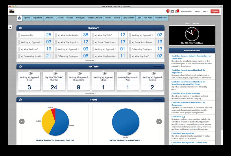
The final My Dashboard feature is something that I’m quite proud of. A fellow developer, Vlad, did an excellent job of implementing the backend and admin portions. The Product Team’s vision and desire to make it Pop! created something great. The fact that we didn’t have to support IE8 helped a lot in the implementation. Below is a screenshot of how My Dashboard looked when we completed the project.
Angular isn’t mentioned much in this article. That’s because we didn’t have to do much to the existing Angular code to implement the new design. It was just a matter of writing/modifying some CSS, as well as introducing some JavaScript for colored rows and show more. If you know how these features could be written in a more Angular Way, I’d love to hear about it.
If you’d still like to learn more about Angular and why it’s good to integrate it little by little, I encourage you to read 5 reasons to use AngularJS in the corporate app world.