 26 октября — го 2012 является большим днем для Microsoft: запуск Windows 8, Internet Explorer 10 и планшет от Microsoft: поверхности. С точки зрения ОС и HTML5 это действительно большой шаг для Microsoft и всех веб-разработчиков (даже не мобильных). Давайте рассмотрим, что для нас важно.
Начну с плохих новостей: вам нужно пойти и подготовить свои сайты к новой экосистеме .
Даже если у вас есть только веб-сайт, оптимизированный для ПК, вам нужно пойти и подготовить его. И если вы думаете: «Эй, это не повлияет на мой мобильный сайт, потому что это только для планшетов», вы ошибаетесь.
Часть содержания этого поста взята из моей книги « Программирование мобильной сети, второе издание », которая скоро будет опубликована.
обзор
В этом посте мы рассмотрим:
- Планшет Microsoft Surface
- Internet Explorer 10 режимов
- Flash Player
- Совместимость с HTML5
- Совместимость с CSS3
- Режим привязки и проблема области просмотра
- Идентификация на стороне сервера
- Закрепленные сайты
- Планшет симулятор
- Интеграция магазина приложений
- Приложения для Магазина Windows HTML5
Планшет Microsoft Surface
Windows 8 будет работать на различных устройствах, начиная с нескольких дней; оно будет доступно в виде обновления для Windows XP / Vista / 7 для настольных компьютеров, и многие новые настольные компьютеры и ноутбуки начнут поставляться вместе с ним. Однако в этом блоге я больше сосредоточен на мобильных устройствах, и Microsoft Surface , вероятно, является первым мобильным устройством с этой операционной системой.
Другие поставщики оборудования также начинают поставлять планшеты с Windows 8, но Microsoft будет похожа на ключевое устройство в этой среде.
Во-первых, важно понимать, что Windows 8 доступна в RT- версии и в более классической версии. Версия RT работает только на устройствах на базе ARM, таких как большинство планшетов. Другая версия (доступная во многих редакциях, например Pro) предназначена для устройств, совместимых с Intel.

Планшет Surface доступен как в версиях RT, так и в версии Win8 Pro, поскольку последняя версия недоступна на момент написания этой статьи. Почему это так важно? Версия RT не включает в себя режим полного рабочего стола , а это значит, ни классических окон, нет настольных браузеров , которые могут быть использованы. ОБНОВЛЕНИЕ : RT версия имеет режим рабочего стола, но она запускает только приложения Microsoft, но не приложения x64 или x64, такие как другие браузеры.
Пользователи настольных компьютеров и пользователи планшетов Windows 8 Pro смогут установить любой совместимый с Windows браузер, например, Google Chrome, Firefox или Opera. Однако они могут быть не оптимизированы для просмотра с сенсорным экраном.
Surface — широкоэкранный планшет (16: 9) с экраном средней плотности 1366 × 768 пикселей . Версия RT поддерживает 5 одновременных касаний и имеет типичные сенсоры планшета, такие как акселерометр, гироскоп и магнитометр.
В версии RT только приложения в Магазине Windows могут быть установлены / куплены . Приложения Магазина Windows (ранее известные как приложения Metro) могут быть разработаны с использованием .NET или HTML5 и должны соответствовать правилам магазина. С точки зрения ограничений и доступа к функциям, мы можем сказать, что это похоже на iPad. Это не то же самое, но вы не получаете доступ ко всему, что вы хотите, как в классической разработке Windows.
Хотя Firefox работает над версией браузера для Магазина Windows , мне не ясно, будет ли он одобрен в магазине или нет. Это может быть просто сенсорный режим для не RT устройств (которые могут устанавливать приложения без магазина).
Internet Explorer 10 режимов
На Windows 8 RT, включая планшет Surface, браузер может работать в трех режимах:
1) Пейзаж или портрет : IE10 — единственный активный экран переднего плана. На портретном изображении по умолчанию видное окно составляет 1024 пикселей.
IE10 снимает весь доступный экран в альбомной и портретной ориентации
2) Snap mode: it’s sharing the active screen with some other Windows 8 Store app and the browser is snapped (right or left) using just a small portion of the screen (always same size). It only works on landscape mode and when the device has at least 1366px width.
When in snap mode, IE10 will be using less than a quarter of the available screen
3) Fill mode: it’s sharing the active screen with some other Windows 8 Store app in snap mode and the browser is talking 3/4 of the screen (filled). It only works on landscape mode and when the device has at least 1366px width.
IE10 can also share the screen with other snap app
On desktop mode, you can use a non-touch optimized Internet Explorer 10. That mode is the IE that we are used to. Internet Explorer 10 on desktop mode is available on both RT and non-RT versions of Windows 8.
Flash Player
Flash Player? What is that? ? Jokes apart, you believe you are in a desktop world with IE10 and you are not. Remember, “desktop meets mobile web”. Internet Explorer in desktop mode will support as much plugins as you want including Flash Player.
Most tablets, including the initial Surface, will use Windows 8 Store mode and that means no plugins, no Flash, HTML5 only. Well, that’s not completely true but your life will be much easier if you believe in that. Today, a week before Surface appears on the market, I don’t have any clear answer to know if it will include Flash Player or not.
However what I do know is that, if the device includes a Flash Player, IE10 on Windows 8 store mode (ex-Metro mode) will have it disabled by default. If you are not using a restricted API you can send an e-mail to Microsoft so they can white-list your website so Flash movies will work on your website. As weird as it sounds, you need to send an email to be white-listed. If not, you can add a meta tag or an HTTP Header so Windows 8 store Internet Explorer will suggest you to move to desktop mode. Too complex in my opinion.
HTML5 Compatibility
Some good news! If we compare IE9 and IE10 I believe it’s one of the biggest steps from one version to the next one in the browser history. I know, they’ve taken 19 months to upgrade IE9.
IE10 supports:
- New form input types and validation API (excepting date-related ones and color)
- Application Cache
- Web Sockets
- Web Workers
- History
- Drag and Drop
- XHR 2
- File API
- IndexedDB
- Page Visibility
- DeviceOrientation
- Touch, Pointer and Gesture APIs (non-standard)
- Animation Timing API (aka requestAnimationFrame)
If we compare it with Safari on iOS6, IE10 doesn’t have Web Audio and Web SQL (and it’s not going to add it in the future in favor of IndexedDB).
CSS3 compatibility
In terms of CSS3, IE10 has reached other browsers and in some situation has passed them with the addition of some experimental standards. IE10 is one of the first browsers supporting unprefixed well-known features, such as animations or transitions and it uses -ms- for other experimental styles.
IE10 supports:
- CSS Animations
- CSS Transitions
- CSS 2D and 3D transforms
- CSS Fonts
- CSS Gradients
- CSS Device Adaptation (viewport definition through CSS)
- CSS Exclusions
- CSS Flexible Box (aka FlexBox)
- CSS Grid Layout
- CSS Multi-column layout
- CSS Regions
-
CSS Filter
Snap mode and the viewport problem
As we saw before, our website can be browser in IE10 snap mode. And as you can see, IE10 maintains a default 1024px viewport if the current browser window is narrower than that width. Therefore every, again, every website today will be zoomed out by default as seen in the picture.
With the snap mode, desktop meets mobile web because every website should now have a similar mobile view for IE10 snap mode, even for desktop devices.

Any desktop website -such as NYTimes.com- will be zoomed out unless you define a viewport as in the image below for mediaqueriestest.com
If your website has a responsive design and will automatically work properly on a narrower screen, you can use the following viewport declaration
@-ms-viewport { width: device-width; }
To make our lives even stranger device-width will not be device’s width when in snap mode but the current window width.
If your website is not responsive and you want to provide a snap view mode you can define your own viewport mixed with some media queries as the following example:
@media only screen and (max-width: 400px) {
@-ms-viewport { width: 320px; }
}
Using 320px as a viewport will match most mobile device-width values, such as Safari on iPhone. I have a full explanation of this on my book (too much space to cover it in this post) and you can check Tim Kadlec great post.
Server-side identification
While you can use feature detection for most situations, sometimes server-side detection is necessary. The User Agent will never include hardware details. So we don’t know if we are on a Surface or other vendor’s tablet.
We can search for Windows NT 6.2 to know we are on Windows 8, the Touch keyword will be there on touch devices and the ARM word will be on Windows 8 RT devices.
Pinned sites
We can pin websites to the Start Screen and customize its appearance defining our own tile icon and the background image.
To do so we use the msapplication-TileImage and msapplication-TileColor meta tags:
<meta name="msapplication-TileImage" content="tile.png">
<meta name="msapplication-TileColor" content="#ef0303">
The tile image should be a 144×144 PNG file, with a preferred transparent background and the tile color accepts a CSS color as a value that should be the main color of your logo or visual presence. We can use hexadecimal RGB values (such as #333333), named values (such as red) or using CSS functions, such as rgb. If you don’t provide a color, IE will take it from the most prominent color of your website icon or your tile image. The color and icons are also used in history search and other places inside Internet Explorer.

To combine with other icons, you can use just a white or black small icon over a plan color instead of a big colorful image. IE10 tile size 144×144 is the same as the iPad high-resolution icon size. However, be careful using the same icon for both platform as the idea of how they are being rendered on the screen is really different.
Internet Explorer 10 will use your current title page for the tile. If we want to define a different one, we can use the title meta tag.
<meta name="title" content="Tile title">
Live badge notifications
Of the big advantages of tile icons in Windows is the ability to update a badge number in the Start screen, so it becomes a Live Tile. Internet Explorer will poll for updates for pinned sites if we provide the right details.
First action is to create a badge XML, a really simple XML file that defines current badge number value to show inside the Tile. Of course, we can make a dynamic XML file.
The XML looks like
<?xml version="1.0" encoding="utf-8" ?>
<badge value="5" />
And then, we define using a msapplication-badge meta tag, the badge meta data, including frequency, and badge XML URL.
<meta name="msapplication-badge" content="frequency=1440; polling-uri=http://mysite.com/badge.xml">
Tablet simulator
If you install Windows 8 on a desktop computer, Intel-based tablet or notebook, you can test most of the features of IE10. You can download a preview version for developers at the IE10 Test Drive site.
However, for some situations, such as gesture events, orientation changes, etc. tablets and the RT version may be different.
We can install a Windows Simulator that works only on Windows 8 and acts like a generic tablet device. You can download it for free included with Visual Studio Express for Windows 8.

The Simulator allows us to emulate:
- Mouse, pointer or touch events
- Gestures
- Device rotation
- Geolocation
- Different screen resolutions
Store app integration
If you have a Windows Store app (on Windows 8) you can connect your website to it with some meta tags. Internet Explorer will show a menu as shown in next image so the user can quickly get the app from the store if it’s not already installed. If the app is installed then the menu changes to Switch to <name> app.
If you are thinking on the similarities between this feature and Smart App Banners on iOS 6, you are right. However, Microsoft has announced this feature before Apple.
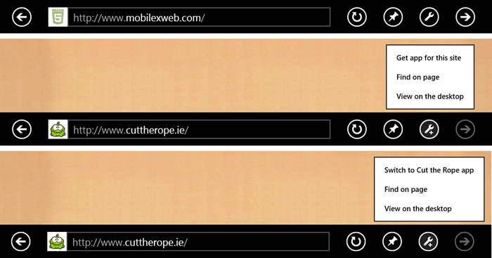
In this case, a non-integrated website; a website that is integrated with an app (uninstalled); and the integration when the app is already installed.
There are five meta tags that can be defined in our website for this connection.
- msApplication-ID: Mandatory. The identification that is defined in the application manifest.
- msApplication-PackageFamilyName. Mandatory. Package family created by Microsoft Visual Studio to identify the app.
- msApplication-Arguments. Optional. String that is going to be passed to your app. If we don’t provide this meta information, Internet Explorer will pass the current URL automatically.
- msApplication-MinVersion. Optional. Enforces a minimum version of your app. Therefore, if your user has an older version when she tries to switch to the app, she will be first sent to the store to update it.
- msApplication-OptOut. Optional. Allow our HTML document to not use the connection on some situations. Possible values are: install that will prevent the installation invitation if it’s not installed, switch that will prevent the switch invitation if the app is installed and both.
The Windows Store App can be created using HTML5, C++, C# or Visual Basic and it must be approved by Microsoft on the store using a Publisher account.
To show you an example Cut the Rope is an addictive game available on many mobile platforms -such as iOS and Android- and they are offering an HTML5 version available -sponsored by Internet Explorer 10- online at http://cuttherope.ie. The game is also available as a Windows Store app so to offer the functionality seen on the figure they are using the following meta tags.
<meta name="msApplication-ID" content="App"/>
<meta name="msApplication-PackageFamilyName"
content="ZeptoLabUKLimited.CutTheRope_sq9zxnwrk84pj"/>
Remember you can find this info and more details on this and other stuff around mobile web on my book.
Windows Store HTML5 Apps
Using HTML5 and Visual Studio we can create native apps that can be distributed through the Store. The HTML5 engine uses all of the IE10 engine and much more. When in HTML5 App, we have other API, other possibilities and styles from CSS and some specifics to native app, as working with native controls using just divs.
Conclusion
IE10 is the biggest step in Microsoft’s web life. Finally, IE meets modern HTML5 and it will make a change in the web world, as desktop or classic web meets mobile. Responsive sites will be more important in a world where users want our content anywhere. Just keep in mind that performance is one of the key issues of responsive sites; just be careful.
What do you think? Anything else that you believe I’ve not added in this list? Comment below.