Мы занимаемся веб-приложениями на iOS уже несколько лет: это веб-сайты, которые после установки главного экрана становятся полнофункциональным полноэкранным приложением с точки зрения пользователя. Наконец, Chrome 31 предлагает такой подход для устройств Android: приложения HTML5 без необходимости упаковки и использования магазина для распространения.
Chrome 31 для Android, доступный как бета-версия на момент написания этой статьи, переносит веб-приложения с домашним экраном в мир Android, следуя подходу Apple: с помощью объявлений <meta> и с участием пользователя добавление веб-сайта на главный экран. Google назвал полноэкранную возможность «полноэкранным режимом приложения», а возможность добавить значок на домашний экран называется «ярлык приложения».
Хотя сегодня Chrome поддерживает некоторые собственные метатеги Apple в целях совместимости, Google предлагает использовать версии без поставщиков для обеспечения совместимости в будущем.
Если мы смешаем полноэкранный режим приложения с кешем приложений, мы можем обеспечить полноценное автономное приложение без создания собственного пакета приложения Android. Подобный подход был доступен ранее в Firefox для Android с открытыми веб-приложениями и в серии Kindle Fire с недавней платформой Amazon Web app .
Настройка ярлыка
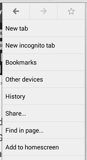
В Chrome теперь есть опция «Добавить на домашний экран» в меню, которая позволяет нам добавлять ярлыки к любому URL. Даже если мы не хотим создавать полноэкранное веб-приложение, нам следует обновить значок нашего веб-сайта, чтобы он соответствовал рекомендациям Chrome, поскольку пользователь может добавить любой веб-сайт на домашний экран, даже контент, оптимизированный для рабочего стола.
Chrome will make use of the apple-touch-icon and apple-touch-icon-precomposed link (Apple’s proprietary declaration for home screen icons) but recommends the usage of the standard “shortcut icon” link with a square size of 196×196 (the recommended size for multiple resolutions). If it’s not defined on that size it will take 128×128 or apple’s icons.
<link rel="shortcut icon" sizes="196x196" href="icon-196x196.png">
If we provide both shortcut icon and apple-touch-icon declarations, Chrome will use the shortcut icon so we can have a multiplatform web app providing both iOS and Android. If you want to check all the available icon sizes on iOS, check Programming the Mobile Web or this blog post.
Remember: we should define the icon even if we don’t want a full-screen webapp, because the user can add any website to the home screen. If you have an icon for iOS, you may be OK for a while, but you should add the high resolution 196px version if you want to support xxhdpi devices, such as Galaxy SIV.
To get more information about Android iconography, check the official icon design guide.
If you don’t provide a high resolution touch icon, it will use your old favicon inside a paper bigger icon (next figure). It nicely uses the most prominent color of the small favicon for effects on the icon.
IMPORTANT #1: The icon will be available on the Home Screen and not on the Applications menu. This is a restriction from the Android OS itself.
IMPORTANT #2: This mechanism will not work on Chrome on iOS because of OS restrictions.
Web App Name
The Web app icon will be defined by the user when confirming the icon on the home screen, but it will be based on the <title> element on your website. There is no way to define one title for SEO and the browser, and a different name for the home screen icon. On iOS, Apple supports an undocumented meta tag (apple-mobile-web-app-title) that is ignored by Chrome at the time of this writing.
Forcing App Mode with Web App Capable
To define that we want our app to be executed as a full-screen webapp (“app mode”), we should use the unprefixed meta tag:
<meta name="mobile-web-app-capable" content="yes">
For a while, Chrome will also support the Apple-prefixed version:
<meta name="apple-mobile-web-app-capable" content="yes">
Nokia Browsers for Symbian and MeeGo (RIP both) follow a similar approach.
From a web perspective, being web app capable means that our content will work properly when:
- There is no URL bar.
- There is no back or forward buttons on screen (on Android, we will always have the soft/hard back button anyway).
- There is no reload button, so everything should be managed by the app. If we change the contents to get the updates the user will need to wait until it’s removed from memory by the OS, to remove the app from the Recent App list or we can provide our own reload button.
- Besides orientation change, there will be no viewport changes (such as toolbar appearing/disappearing).
It’s important to highlight that we can debug webapps using the same remote inspection tools available for Chrome on Android.
In terms of HTML5 APIs, security and cross-domain policies, a full-screen context is exactly the same as running inside Chrome.
Detecting Full-screen
There is no official way to detect if your HTML is being executed in browser mode or app mode (full screen). The iOS navigator.standalone Boolean property is not supported. However, we can use the following quick polyfill to detect whether we are in app mode or not. Please do it before the onload event, so you make sure you are not in browser mode after a page scroll (where the toolbar is also hidden).
navigator.standalone = navigator.standalone || (screen.height-document.documentElement.clientHeight<40)
This snippet asks about the available viewport height and compares it with the device height to see if the URL bar is on the screen.
The Web App UI
In the Android OS, when we open a web app it appears in the Recent Apps list as “Web app” (not our page’s title) and it look in a different spot than Chrome. However, the process used by both Web apps and the browser is the same, so if we close the Chrome process it will also close all Web app sessions.
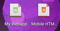
If you open more than one webapp, you will see different “Web app” titles in the Recent App list, as in the next figure:
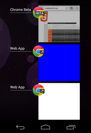
There is no way to define the image to show on the recent app list; Chrome will take a snapshot of the app.
Opening Links
When you open a link (through an <a> element or JavaScript), Chrome will load it inside our webapp Activity (window) instead of the browser. If we are loading a file from a different domain it will alert the user of that situation adding a small URL bar at the top:
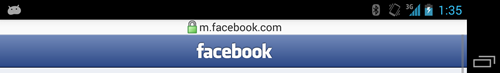
This is particularly useful for OAuth login mechanism, so we can use Facebook Connect for example to log the user in without leaving our webapp context.
If we want to force a link to open in Chrome, we need to use the standard target=”_blank”.
From a webapp we can communicate with other native apps using standard Android Intent URLs, such as opening Maps or making a call. If you want to know more about this, check Chapter 15 of Programming the Mobile Web.
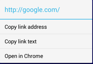
All the links will have a contextual menu (after a long-press gesture) with a “Open in Chrome” option.
Differences with iOS Webapps
Chrome doesn’t support the advanced webapp techniques (poorly documented by Apple), such as:
- Additional meta tags for status bar style and title
- Additional link for launch image
- Navigator.standalone Boolean property
On the other hand, Chrome-based webapps have the ability to go back in history using the back soft/hard key on Android, while on iOS there is no way to do that. Chrome also keeps the current URL (particularly useful for single page webapps) between sessions, so if the user comes back to the webapp a year later it will keep its current state. On iOS every time you re-open the webapp it load the first URL from scratch.
Other differences appear when opening external links: by default on iOS, any external HTML (through elements) will open in Safari and not inside the Web app context. On Chrome-based webapps, any external HTML is opened inside our webapp context but alerting the user that is now in a different domain as you can see in the image above (Facebook example).
On Chrome webapps, the storage context is the same as in Chrome. Therefore, localStorage, SQL Storage, IndexedDB stores will be shared between the browser and the Web app. On the other hand, on iOS from 6.0, contexts are different, so you can’t share data between webapps and websites.
On iOS, when you quit a webapp and open it again, it will always be refreshed; on Chrome it will be up to the operating system resources, so if you re-open the same webapp quickly, it will just restore the previous app context.
Looking Forward
At this point, an HTML5 document running in browser mode with Chrome or in “App mode” has exactly the same permissions and abilities. Because Chrome Packaged apps are available for other platforms, it’s not clear yet if “App mode” apps will have Chrome app API support in the future or if we will need to package them as APKs.
One of the biggest challenges of Web apps is discoverability, so besides asking the user to “install” the app to the home screen on our HTML, a Web app guide or store will be much useful for this problem.
In the future I’d like to see also some UI improvements, such as:
- Define launch images (to avoid a white blank screen while loading)
- Define the available orientations (so we can lock an HTML5 game in landscape mode for example)
- Avoid the installation of the icon if the same URL is already installed in the homescreen
- Discover if a full-screen icon is available and launch the full-screen version from Chrome in that case
This is a great step forward for webapp development, and I hope the Chrome team will enhance the abilities and discoverability of web apps in the future.
Any wish for the future? Use the comment section below.