Даже если вы никогда не прикасались к iPhone раньше, вы, вероятно, знакомы с печально известной кнопкой «сдвинуть, чтобы разблокировать», и, возможно, всегда хотели кнопку прокрутки для приложений Android.
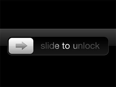
Первоначальная цель этой кнопки состояла в том, чтобы предотвратить случайное разблокирование устройства в кармане. В создаваемых вами мобильных приложениях может быть аналогичный вариант использования, когда вы хотите дать пользователю возможность подтвердить определенное действие. В приложении Uber для водителей есть такая кнопка, которую водитель проводит слева направо, чтобы подтвердить, что он хочет начать путешествие.
Обычно решение состоит в том, чтобы предложить пользователю всплывающее окно для подтверждения действия, но это не вдохновляющее решение. Давайте попробуем создать нашу собственную кнопку прокрутки для Android.

Финальный код проекта находится на GitHub .
Начиная
Создайте новый проект в Android Studio с пустым действием .
Добавьте класс с именем SwipeButtonButton, и добавьте в него следующее:
 import android.content.Context;
import android.util.AttributeSet;
import android.widget.Button;

public class SwipeButton extends Button {
    public SwipeButton(Context context) {
        super(context);
    }

    public SwipeButton(Context context, AttributeSet attrs) {
        super(context, attrs);
    }

    public SwipeButton(Context context, AttributeSet attrs, int defStyleAttr) {
        super(context, attrs, defStyleAttr);
    }

}
Для требуемой функциональности вам придется поиграть с прослушивателем onTouchEvent В слушателе вы захватываете, когда пользователь нажимает, пролистывает или отпускает кнопку. Переопределите onTouchEventSwipeButton
 @Override
public boolean onTouchEvent(MotionEvent event) {

  switch (event.getAction()) {
      // when user first touches the screen we get x and y coordinate
      case MotionEvent.ACTION_DOWN: {
          //when user first touches the screen change the button text to desired value
          break;
      }
      case MotionEvent.ACTION_UP: {
          //when the user releases touch then revert back the text
          break;
      }
      case MotionEvent.ACTION_MOVE: {
          //here we'll capture when the user swipes from left to right and write the logic to create the swiping effect
          break;
      }
  }

  return super.onTouchEvent(event);
}
Код выше обрабатывает три случая, которые я расскажу более подробно:
- Когда пользователь впервые касается кнопки
- Когда пользователь проводит пальцем по кнопке.
- Когда пользователь отпускает кнопку после завершения пролистывания или где-то посередине.
1. Когда пользователь впервые касается кнопки
Вам нужно сделать следующее:
- Получите координаты x и y того места, где пользователь коснулся кнопки из объекта
MotionEventonTouchEvent - Измените текст или цвет кнопки.
Вот код:
 public class SwipeButton extends Button {
  private float x1;
  //x coordinate of where user first touches the button
  private float y1;
  //y coordinate of where user first touches the button
  private String originalButtonText;
  //the text on the button
  private boolean confirmThresholdCrossed;
  //whether the threshold distance beyond which action is considered confirmed is crossed or not
  private boolean swipeTextShown;
  //whether the text currently on the button is the text shown while swiping or the original text

  ...

  @Override
  public boolean onTouchEvent(MotionEvent event) {

      switch (event.getAction()) {
          case MotionEvent.ACTION_DOWN: {
              x1 = event.getX();
              y1 = event.getY();
              // when user first touches the screen we get x and y coordinate

              this.originalButtonText = this.getText().toString();
              //save the original text on the button

              confirmThresholdCrossed = false;
              //action hasn't been confirmed yet

              if (!swipeTextShown) {
                  this.setText(">> SWIPE TO CONFIRM >>");
                  //change the text on the button to indicate that the user is supposed to swipe the button to confirm
                  swipeTextShown = true;
              }
              break;
          }
          ...
      }

      return super.onTouchEvent(event);
  }
  }
2. Когда пользователь проводит по кнопке
Когда пользователь нажимает кнопку, должно произойти следующее:
- Измените текст, если хотите.
- Отобразите эффект смахивания, манипулируя градиентом, когда пользователь проводит пальцем по кнопке.
LinearGradient используется для отображения эффекта смахивания с эффектом градиента из трех цветов. Когда пользователь проводит пальцем, этот градиент перемещается слева направо, создавая желаемый эффект.
 public class SwipeButton extends Button {

  ...
  private boolean swiping = false;
  private float x2Start;
  //whether the text currently on the button is the text shown while swiping or the original text


  @Override
  public boolean onTouchEvent(MotionEvent event) {
    switch (event.getAction()) {
      ...
      case MotionEvent.ACTION_MOVE: {
          //here we'll capture when the user swipes from left to right and write the logic to create the swiping effect

          float x2 = event.getX();
          float y2 = event.getY();

          if(!swiping){
              x2Start = event.getX();
              //this is to capture at what x swiping started
              swiping = true;
          }

          //if left to right sweep event on screen
          if (x1 < x2 && !confirmThresholdCrossed) {
              this.setBackgroundDrawable(null);

              ShapeDrawable mDrawable = new ShapeDrawable(new RectShape());

              int gradientColor1 = 0xFF333333;
              int gradientColor2 = 0xFF666666;
              int gradientColor2Width = 50;
              int gradientColor3 = 0xFF888888;
              double actionConfirmDistanceFraction = 0.6;
              //We'll get to how to be able to customize these values for each instance of the button


              Shader shader = new LinearGradient(x2, 0, x2 - gradientColor2Width, 0,
                      new int[]{gradientColor3, gradientColor2, gradientColor1},
                      new float[]{0, 0.5f, 1},
                      Shader.TileMode.CLAMP);

              mDrawable.getPaint().setShader(shader);
              this.setBackgroundDrawable(mDrawable);


              if (swipeTextShown == false) {
                  this.setText(">> SWIPE TO CONFIRM >> ");
                  //change text while swiping
                  swipeTextShown = true;
              }

              if ((x2-x2Start) > (this.getWidth() * actionConfirmDistanceFraction)) {
                  Log.d("CONFIRMATION", "Action Confirmed! Read on to find how to get your desired callback here");
                  //confirm action when swiped upto the desired distance
                  confirmThresholdCrossed = true;
              }
          }
      }
      ...
3. Когда пользователь отпускает кнопку
Теперь, когда пользователь отпускает кнопку, будет две возможности:
- Пользователь освобождает до подтверждения действия. Значение, прежде чем пересечь пороговое расстояние, пользователь должен провести пальцем для подтверждения действия.
- Пользователь отпускает после подтверждения действия, то есть после пересечения порогового расстояния.
Они оба описаны в следующем фрагменте:
 ...
case MotionEvent.ACTION_UP: {
  //when the user releases touch then revert back the text
  swiping = false;
  float x2 = event.getX();
  int buttonColor = swipeButtonCustomItems.getPostConfirmationColor();
  String actionConfirmText = swipeButtonCustomItems.getActionConfirmText() == null ? this.originalButtonText : swipeButtonCustomItems.getActionConfirmText();
  //if you choose to not set the confirmation text, it will set to the original button text;

  this.setBackgroundDrawable(null);
  this.setBackgroundColor(buttonColor);
  swipeTextShown =  false;


  if ((x2-x2Start) <= (this.getWidth() * swipeButtonCustomItems.getActionConfirmDistanceFraction())) {
      Log.d("CONFIRMATION", "Action not confirmed");
      this.setText(originalButtonText);
      swipeButtonCustomItems.onSwipeCancel();
      confirmThresholdCrossed = false;

  } else {
      Log.d("CONFIRMATION", "Action confirmed");
      this.setText(actionConfirmText);
  }

  break;
}
...
Некоторые атрибуты, такие как цвета градиента, на данный момент жестко запрограммированы. Они будут установлены для каждого экземпляра кнопки и будут иметь возможность устанавливать функции обратного вызова, когда пользователь выполняет определенные действия с кнопкой.
Установить атрибуты
Атрибуты, которые вы можете настроить для каждого экземпляра SwipeButton
- Три цвета градиента.
- Ширина покрыта вторым градиентным цветом.
- Доля расстояния от ширины
Button - Текст, который появляется, когда пользователь нажимает или проводит по кнопке.
Вы также можете предоставить возможность назначать обратные вызовы для случаев, когда пользователь:
- Нажимает кнопку.
- Проведите пальцем до нужного расстояния для подтверждения.
- Отпускает кнопку без подтверждения.
Чтобы принять эти атрибуты и обратные вызовы, создайте другой класс и сделайте его абстрактным.
 public abstract class SwipeButtonCustomItems {
    //These are the default values if we don't choose to set them later:
    public int gradientColor1 = 0xFF333333;
    public int gradientColor2 = 0xFF666666;
    public int gradientColor2Width = 50;
    public int gradientColor3 = 0xFF888888;
    public int postConfirmationColor = 0xFF888888;
    public double actionConfirmDistanceFraction = 0.7;
    public String buttonPressText = ">>   SWIPE TO CONFIRM   >> ";

    public String actionConfirmText = null;

    public int getGradientColor1() {
        return gradientColor1;
    }

    public SwipeButtonCustomItems setGradientColor1(int gradientColor1) {
        this.gradientColor1 = gradientColor1;
        return this;
    }

    public int getGradientColor2() {
        return gradientColor2;
    }

    public SwipeButtonCustomItems setGradientColor2(int gradientColor2) {
        this.gradientColor2 = gradientColor2;
        return this;
    }

    public int getGradientColor2Width() {
        return gradientColor2Width;
    }

    public SwipeButtonCustomItems setGradientColor2Width(int gradientColor2Width) {
        this.gradientColor2Width = gradientColor2Width;
        return this;
    }

    public int getGradientColor3() {
        return gradientColor3;
    }

    public SwipeButtonCustomItems setGradientColor3(int gradientColor3) {
        this.gradientColor3 = gradientColor3;
        return this;
    }

    public double getActionConfirmDistanceFraction() {
        return actionConfirmDistanceFraction;
    }

    public SwipeButtonCustomItems setActionConfirmDistanceFraction(double actionConfirmDistanceFraction) {
        this.actionConfirmDistanceFraction = actionConfirmDistanceFraction;
        return this;
    }

    public String getButtonPressText() {
        return buttonPressText;
    }

    public SwipeButtonCustomItems setButtonPressText(String buttonPressText) {
        this.buttonPressText = buttonPressText;
        return this;
    }

    public String getActionConfirmText() {
        return actionConfirmText;
    }

    public SwipeButtonCustomItems setActionConfirmText(String actionConfirmText) {
        this.actionConfirmText = actionConfirmText;
        return this;
    }

    public int getPostConfirmationColor() {
        return postConfirmationColor;
    }

    public SwipeButtonCustomItems setPostConfirmationColor(int postConfirmationColor) {
        this.postConfirmationColor = postConfirmationColor;
        return this;
    }

    //These methods listed below can be overridden in the instance of SwipeButton
    public void onButtonPress(){

    }

    public void onSwipeCancel(){

    }

    abstract public void onSwipeConfirm();
}
Теперь вам нужен установщик в главном классе SwipeButton Используя сеттер, вы можете установить нужные атрибуты и обратные вызовы. С учетом всех случаев, а также атрибутов и обратных вызовов, взятых из экземпляра абстрактного класса, вот как теперь выглядит класс SwipeButton
 public class SwipeButton extends Button {

    private float x1;
    //x coordinate of where user first touches the button
    private float y1;
    //y coordinate of where user first touches the button
    private String originalButtonText;
    //the text on the button
    private boolean confirmThresholdCrossed;
    //whether the threshold distance beyond which action is considered confirmed is crossed or not
    private boolean swipeTextShown;
    private boolean swiping = false;
    private float x2Start;
    //whether the text currently on the button is the text shown while swiping or the original text

    private SwipeButtonCustomItems swipeButtonCustomItems;
    //in this instance of the class SwipeButtonCustomItems we can accept callbacks and other params like colors

    public SwipeButton(Context context) {
        super(context);
    }

    public SwipeButton(Context context, AttributeSet attrs) {
        super(context, attrs);
    }

    public SwipeButton(Context context, AttributeSet attrs, int defStyleAttr) {
        super(context, attrs, defStyleAttr);
    }

    public void setSwipeButtonCustomItems(SwipeButtonCustomItems swipeButtonCustomItems) {
        //setter for swipeButtonCustomItems
        this.swipeButtonCustomItems = swipeButtonCustomItems;
    }

    @Override
    public boolean onTouchEvent(MotionEvent event) {

        switch (event.getAction()) {
            case MotionEvent.ACTION_DOWN: {
                // when user first touches the screen we get x and y coordinate
                x1 = event.getX();
                y1 = event.getY();

                this.originalButtonText = this.getText().toString();

                confirmThresholdCrossed = false;

                if (!swipeTextShown) {
                    this.setText(swipeButtonCustomItems.getButtonPressText());
                    swipeTextShown = true;
                }

                swipeButtonCustomItems.onButtonPress();
                break;
            }
            case MotionEvent.ACTION_MOVE: {
                //here we'll capture when the user swipes from left to right and write the logic to create the swiping effect

                float x2 = event.getX();
                float y2 = event.getY();

                if(!swiping){
                    x2Start = event.getX();
                    //this is to capture at what x swiping started
                    swiping = true;
                }

                //if left to right sweep event on screen
                if (x1 < x2 && !confirmThresholdCrossed) {
                    this.setBackgroundDrawable(null);

                    ShapeDrawable mDrawable = new ShapeDrawable(new RectShape());

                    int gradientColor1 = swipeButtonCustomItems.getGradientColor1();
                    int gradientColor2 = swipeButtonCustomItems.getGradientColor2();
                    int gradientColor2Width = swipeButtonCustomItems.getGradientColor2Width();
                    int gradientColor3 = swipeButtonCustomItems.getGradientColor3();
                    double actionConfirmDistanceFraction = swipeButtonCustomItems.getActionConfirmDistanceFraction();
                    //Note that above we replaced the hard coded values by those from the SwipeButtonCustomItems instance.


                    Shader shader = new LinearGradient(x2, 0, x2 - gradientColor2Width, 0,
                            new int[]{gradientColor3, gradientColor2, gradientColor1},
                            new float[]{0, 0.5f, 1},
                            Shader.TileMode.CLAMP);

                    mDrawable.getPaint().setShader(shader);
                    this.setBackgroundDrawable(mDrawable);


                    if (swipeTextShown == false) {
                        this.setText(swipeButtonCustomItems.getButtonPressText());
                        //change text while swiping
                        swipeTextShown = true;
                    }

                    if ((x2-x2Start) > (this.getWidth() * actionConfirmDistanceFraction)) {
                        Log.d("CONFIRMATION", "Action Confirmed!");
                        //Note that below we inserted the desired callback from the SwipeButtonCustomItem instance.
                        swipeButtonCustomItems.onSwipeConfirm();
                        //confirm action when swiped upto the desired distance
                        confirmThresholdCrossed = true;
                    }

                }

                break;
            }
            case MotionEvent.ACTION_UP: {
                //when the user releases touch then revert back the text
                swiping = false;
                float x2 = event.getX();
                int buttonColor = swipeButtonCustomItems.getPostConfirmationColor();
                String actionConfirmText = swipeButtonCustomItems.getActionConfirmText() == null ? this.originalButtonText : swipeButtonCustomItems.getActionConfirmText();
                //if you choose to not set the confirmation text, it will set to the original button text;

                this.setBackgroundDrawable(null);
                this.setBackgroundColor(buttonColor);
                swipeTextShown =  false;


                if ((x2-x2Start) <= (this.getWidth() * swipeButtonCustomItems.getActionConfirmDistanceFraction())) {
                    Log.d("CONFIRMATION", "Action not confirmed");
                    this.setText(originalButtonText);
                    swipeButtonCustomItems.onSwipeCancel();
                    confirmThresholdCrossed = false;

                } else {
                    Log.d("CONFIRMATION", "Action confirmed");
                    this.setText(actionConfirmText);
                }

                break;
            }
        }


        return super.onTouchEvent(event);
    }
}
Чтобы использовать SwipeButton
 <com.package.path.SwipeButton
    android:id="@+id/my_swipe_button"
    android:layout_width="400dp"
    android:layout_height="50dp"
    android:text="Button"
    android:layout_below="@id/hello_world"
    android:background="#888888"
    android:textColor="#ffffff"
    />
Чтобы назначить обратные вызовы и настроить атрибуты, такие как цвета, добавьте следующее в MainActivity
 public class MainActivity extends AppCompatActivity {

  @Override
  protected void onCreate(Bundle savedInstanceState) {
      super.onCreate(savedInstanceState);
      setContentView(R.layout.activity_main);
      SwipeButton mSwipeButton = (SwipeButton) findViewById(R.id.my_swipe_button);

      SwipeButtonCustomItems swipeButtonSettings = new SwipeButtonCustomItems() {
          @Override
          public void onSwipeConfirm() {
              Log.d("NEW_STUFF", "New swipe confirm callback");
          }
      };

      swipeButtonSettings
              .setButtonPressText(">> NEW TEXT! >>")
              .setGradientColor1(0xFF888888)
              .setGradientColor2(0xFF666666)
              .setGradientColor2Width(60)
              .setGradientColor3(0xFF333333)
              .setPostConfirmationColor(0xFF888888)
              .setActionConfirmDistanceFraction(0.7)
              .setActionConfirmText("Action Confirmed");

      if (mSwipeButton != null) {
          mSwipeButton.setSwipeButtonCustomItems(swipeButtonSettings);
      }
  }
}
Случаи использования
Использование этого типа взаимодействия кнопок может быть интересной альтернативой раздражающему уведомлению о подтверждении. Мне было бы интересно узнать, какие варианты использования вы бы имели, пожалуйста, добавьте свои мысли в комментариях ниже.