Как лучше всего отобразить данные об использовании памяти и процессора (в основном) в Clojure? Я буду сравнивать gnuplot, Incanter с JFreeChart и vega-lite (через Oz). (Спойлер: мне больше всего нравится Oz / vega-lite, но я все еще использую Incanter для подготовки данных.)
Данные выглядят так:
|
1
2
3
4
5
|
;; sec.ns | memory | CPU %1541052937.882172509 59m 0.01541052981.122419892 78m 58.01541052981.625876498 199m 85.91541053011.489811184 1.2g 101.8 |
Данные были получены с помощью monitor-usage.sh .
Инструменты
Гнуплот 5
Gnuplot — самый простой, с большим количеством доступных из коробки. Но это также несколько архаично и мало гибко.
Вот код:
|
01
02
03
04
05
06
07
08
09
10
11
12
13
14
15
16
17
18
19
20
21
22
23
24
25
26
27
28
29
30
31
32
33
34
35
36
37
38
39
40
41
42
|
#!/usr/bin/env gnuplot --persist -c# Plot memory and CPU usage over time. Usage:# usage-plot.gp <input file> [<output .png file>]# where the input file has the columns `<unix time> <memory, with m/g suffix> <% cpu>`# To create the input file, see https://gist.github.com/jakubholynet/931a3441982c833f5f8fcdcf54d05c91# Arguments:infile=ARG1outfile=ARG2set term x11set title 'Memory, CPU usage from' . infileset xdata timeset timefmt "%s"set xlabel "Time [[hh:]mm:ss]"set ylabel "Memory usage"set format y '%.1s%cB'set y2label 'CPU usage'set format y2 '%.0s%%'set y2tics nomirrorset tics outset autoscale yset autoscale y2# Credit: Christoph @ https://stackoverflow.com/a/52822256/204205resolveUnit(s)=(pos=strstrt("kmgtp",s[strlen(s):*]), real(s)*(1024**pos))if (exists("outfile") && strlen(outfile) > 0) { print "Outputting to the file ", outfile set term png # 640,480 set output outfile}# Stylingset style line 1 linewidth 2 linecolor 'blue'set style line 2 linecolor 'light-green'#set xtics font ", 10"set tics font ", 10"set xtics rotate 60 # put label every 60s, make vertical so they don't clash in .png if too manyplot infile u 1:3 with lp axes x1y2 title "cpu" linestyle 2, \ infile using 1:(resolveUnit(stringcolumn(2))) with linespoints title "memory" linestyle 1 |
И вот пример вывода:
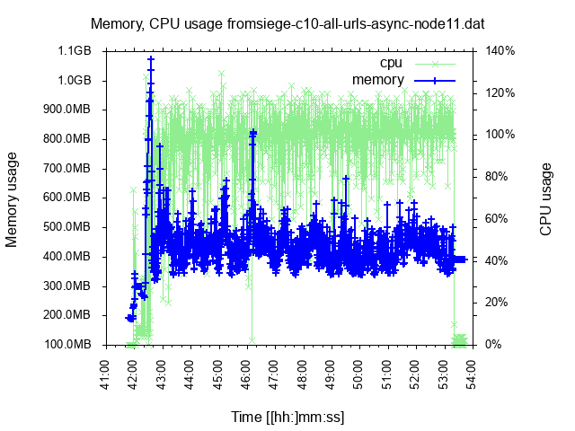
Плюсы: многофункциональный (поддержка байтов оси, две оси Y, чтение данных).
Минусы: архаичный язык, менее гибкий; Я не мог помешать рисованию меток X друг над другом, когда у меня были данные в течение более длительного периода.
Заклинатель (JFreeChart)
Incanter — это (был?) Инструмент для анализа данных в Clojure, и он включает в себя библиотеку Java JFreeChart для построения диаграмм. В последнее время произошли некоторые изменения (с включением clojure.core.matrix), но в остальном это довольно застой. Вот почему были предприняты новые усилия сообщества.
Вот первая часть кода, которая подготавливает данные для построения диаграмм (также используется для Oz):
|
01
02
03
04
05
06
07
08
09
10
11
12
13
14
15
16
17
18
19
20
21
22
23
24
25
26
27
28
29
30
31
32
33
34
35
36
37
38
39
40
41
42
43
44
45
46
|
(ns clj-charting.usage-chart-preparation (:require [incanter.core :refer :all] [incanter.stats :as s] [incanter.io :as io]))(defn- resolve-unit-suffix "Replace values such as 333k, 800m, 1.2g with the corresponding value in bytes" [val-suffixed] (if-let [[_ val unit] (and (string? val-suffixed) (re-find #"(\d+)([kmg])" val-suffixed))] (let [order (case unit "k" 1 "m" 2 "g" 3) scale (apply * (take order (repeat 1024)))] (* (Integer/parseInt val) scale))))(defn read-usage-data "Read usage data in the form `sec.ns memory_with_scale_suffix CPU_percentage` into a dataset with `ms memory_in_bytes CPU_percentage`" [file] (let [data (io/read-dataset file :delim \space)] (-> data ;; Memory: from 300m or 1g to a number: (transform-col :col1 resolve-unit-suffix) ;; CPU: From <sec>.<nano> to <ms>: (transform-col :col0 #(long (* 1000 %))))))(defn moving-window-means "Given very scattered data, produce a similar sequence of 'moving window mean' where we replace each point by the mean of it and the preceding/following `radius` points. " [radius col] (let [x' (concat (repeat radius nil) col) parts (drop-last radius (partition (inc (* 2 radius)) 1 x')) means (map #(-> (remove nil? %) s/mean long) parts)] means)) |
А вот код для форматирования диаграммы (самой сложной задачей было хорошее отображение значений кБ / МБ / ГБ на оси; я действительно пропустил встроенную поддержку Gnuplot):
|
001
002
003
004
005
006
007
008
009
010
011
012
013
014
015
016
017
018
019
020
021
022
023
024
025
026
027
028
029
030
031
032
033
034
035
036
037
038
039
040
041
042
043
044
045
046
047
048
049
050
051
052
053
054
055
056
057
058
059
060
061
062
063
064
065
066
067
068
069
070
071
072
073
074
075
076
077
078
079
080
081
082
083
084
085
086
087
088
089
090
091
092
093
094
095
096
097
098
099
100
101
102
103
104
105
106
107
108
109
110
|
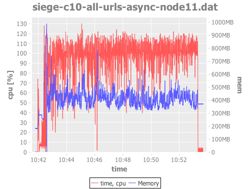
(ns clj-charting.incanter (:require [incanter.core :refer :all] [incanter.charts :refer :all] [clj-charting.usage-chart-preparation :refer [read-usage-data moving-window-means]]) (:import [org.jfree.chart JFreeChart] [org.jfree.chart.plot XYPlot] (org.jfree.chart.axis ValueAxis NumberAxis NumberTickUnit TickUnitSource TickUnit) (java.text NumberFormat DecimalFormat FieldPosition)))(defn merge-y-axis "Merge the Y axis of two line / time series charts. The former chart will have the left Y axis, and the latter will have the right. Incanter does not support 2 Y axes out of the box. Source: https://matthewdowney.github.io/clojure-incanter-plot-multiple-y-axis.html" [^JFreeChart chart ^JFreeChart chart-to-merge] (let [^XYPlot plot (.getPlot chart-to-merge)] (doto ^XYPlot (.getPlot chart) (.setRangeAxis 1 (.getRangeAxis plot)) (.setDataset 1 (.getDataset plot)) (.mapDatasetToRangeAxis 1 1) (.setRenderer 1 (.getRenderer plot))) (-> (.getPlot chart) (.getLegendItems) (.addAll (.getLegendItems plot))) chart))(defn byte-scale "For the given number [in bytes] return [scale, scale suffix] so that we can divide it by the scale and display with the corresponding suffix. Example: 2333 -> [1024 \"kB\"]" [num] (let [k 1024 m (int (Math/pow 1024 2)) g (int (Math/pow 1024 3))] (condp <= num g [g "GB"] m [m "MB"] k [k "kB"] [1 ""])))(defn format-bytes "For the given number [in bytes] return [the number scaled down, the scale suffix such as \"kB\"]. Example: 2333 -> [2.278 \"kB\"]" [num] (let [[scale unit] (byte-scale num)] [(/ num scale) unit]));; Instance of NumberFormat that displays a byte number scaled down and with the scale suffix;; Example: 2333 -> \"2.3kB\"]"(def byteFmt (let [dec-fmt (java.text.DecimalFormat. "#.#")] (proxy [java.text.NumberFormat] [] (format [^double number, ^StringBuffer toAppendTo, ^FieldPosition pos] (let [[n u] (format-bytes number)] (.append (.format dec-fmt n toAppendTo pos) u))))))(defn nearest-byte-tick "For the given byte number, find out what tick to show on the axis; e.g. we would rather see a tick such as '800MB' than '783.5MB' on it." ([^double size tick-fn] (let [[scale] (byte-scale size)] (NumberTickUnit. (* scale ;; FIXME if size = 1000 upgrade to 1024 (.getSize (tick-fn (NumberTickUnit. (/ size scale))))) byteFmt))))(def byte-tick-source "TickUnitSource suitable for byte values spanning multiple of kB - MB - GB" ;; TODO Instead of reusing IntegerTickUnits, reimplement it to support powers of 2 (let [int-tick-units (NumberAxis/createIntegerTickUnits)] (reify TickUnitSource (^TickUnit getLargerTickUnit [_ ^TickUnit unit] (nearest-byte-tick (.getSize unit) #(.getLargerTickUnit int-tick-units %))) (^TickUnit getCeilingTickUnit [me ^TickUnit unit] (.getCeilingTickUnit me (.getSize unit))) (^TickUnit getCeilingTickUnit [_ ^double size] (nearest-byte-tick size #(.getCeilingTickUnit int-tick-units %))))))(defn set-bytes-tick-unit [^JFreeChart chart] (let [^XYPlot plot (.getPlot chart) ^NumberAxis axis (.getRangeAxis plot)] (.setStandardTickUnits axis byte-tick-source) chart))(defn plot-usage [file] (let [data (read-usage-data file) time (sel data :cols 0) mem (sel data :cols 1) cpu (sel data :cols 2)] (-> (time-series-plot time cpu :title file :y-label "cpu [%]" :legend true) (add-lines time (moving-window-means 60 cpu) :series-label "cpu (mean)") (merge-y-axis (set-bytes-tick-unit (time-series-plot time mem :series-label "Memory"))) (view))))(plot-usage "siege-c10-all-urls-async-node11.dat") |
Это довольно безумный объем работы, а? И результат:
Вега-лайт через Оз
Vega и грамматика визуализации Vega-lite: Vega — декларативный формат для создания, сохранения и совместного использования дизайнов визуализации. В Vega визуализация описывается в JSON и генерирует интерактивные представления с использованием HTML5 Canvas или SVG.
Vega-lite (и Vega ) — это новый ребенок на блоке. Он многому научился у D3 и R ggplot2 и предназначен для исследования данных, интерактивных диаграмм и позволяет комбинировать несколько диаграмм на одной странице, одновременно делая это максимально простым. Он основан на грамматике графики, поэтому он, по-видимому, хорошо продуман.
Oz — это тонкая оболочка для vega / vega-lite, которая позволяет взаимодействовать с браузером из Clojure REPL с данными Clojure.
(Примечание: в настоящее время Oz использует VL v2.6, а последний VL v3rc8, который исправляет некоторые ограничения в v2.)
Как упомянуто выше, мы используем тот же use -chart -prepare.clj, что и в примере с чистым Incanter, для подготовки данных для построения диаграмм. Затем, чтобы построить их:
|
01
02
03
04
05
06
07
08
09
10
11
12
13
14
15
16
17
18
19
20
21
22
23
24
25
26
27
28
29
30
31
32
33
34
35
36
37
38
39
40
41
42
43
44
45
46
47
48
49
50
51
52
53
54
55
56
57
58
59
60
61
62
63
64
65
66
67
68
|
(ns clj-charting.oz (:require [oz.core :as oz] [incanter.core :refer :all] [clj-charting.usage-chart-preparation :refer [read-usage-data moving-window-means]]))(defn dataset->map-list "Incanter dataset into a list of maps like {\"0\" 1541065398391, \"1\" 446693376, \"2\" 99.9, \"cpu_mean\" 89}" [ds] (let [rows (to-list ds) means (moving-window-means 60 (sel ds :cols 2))] (map #(assoc (zipmap (map str (range)) %1) "cpu_mean" %2) rows means)));;;;;;;;;;;;;;;;;;;;;;;;;;;;;;;;;;;;;;;;;;;;;;;;;;;;;;;;;;;;;;;;;;;;;;;;;;;;;;;;;;;;;;;;;;;;;;;;;;;;;;;;;;;;;;;;(def gb4 (* 3 1024 1024 1024));; TODO Display legend - IMPOSSIBLE 🙁 until Datum(def line-plot (let [data (dataset->map-list (read-usage-data "siege-c10-all-urls-async-node11.dat")) x-enc {:field "0" :type "temporal" :timeUnit "hoursminutesseconds" ; :aggregate "mean" l <- this kills points with same value :axis {:title "Time"} :scale {:zero false}}] {:width 700 :data {:values data} ;;; ?? requires VL v3 until then we have to compute cpu_mean using Incanter ;:transform [{:window [{:op "mean" ; :field "1" ; :as "cpu_mean"}] ; :frame [-10, 10]}] ; TODO VLv3: use this ?? instead of repeating the X on each plot ;:encoding {:x x-enc} :layer [{:mark {:type "line" :clip true :color "red"} :encoding {:x x-enc :y {:field "1" :type "quantitative" :axis {:format ".1s" :title "Memory" :labelColor "red" #_"required VL 3"} :scale {:domain [0 gb4]}}}} {:layer [ {:mark {:type "point" :clip true} :encoding {:x x-enc :y {:field "2" :type "quantitative" :axis {:title "CPU [%]" :labelColor "blue"}}}} {:mark {:type "line" :clip true :color "blue"} :encoding {:x x-enc :y {:field "cpu_mean" :type "quantitative" :title nil :axis nil}}}]}] :resolve {:scale {:y "independent"}}}))(oz/start-plot-server!)(oz/v! line-plot) |
Это больше работы, чем в Gnuplot, но он обеспечивает большую ценность и намного более мощный.
Вот вывод (сгенерированный с VL v3, поэтому метки имеют тот же цвет, что и линии):
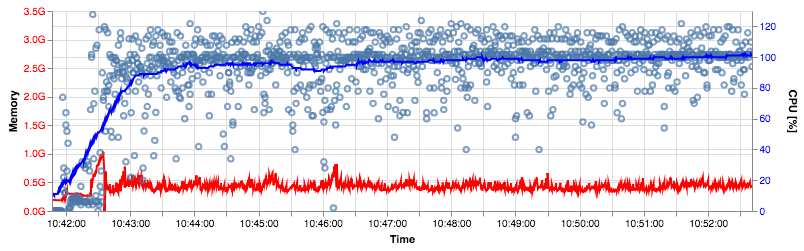
Удивительно то, что диаграммы и данные могут быть закодированы в URL, так что вы можете открыть их в онлайн-редакторе Vega и поиграть с ним .
Плюсы: хороший и мощный дизайн, современный, интерактивный, перспективный.
Минусы: сообщество очень маленькое, поэтому получить помощь сложнее, оно еще не достигло зрелости (например, невозможно добавить легенду в мою многослойную диаграмму). Вы должны преобразовать свои данные в JSON, чтобы они, вероятно, не подходили для их огромных объемов.
Другие опции
Clojurewerkz / envision — это «небольшая, простая в использовании библиотека Clojure для обработки, очистки и визуализации данных. [..] Основная идея этой библиотеки — сделать исследовательский анализ более интерактивным и наглядным, хотя и с точки зрения программиста ». ClojureWerkz известен своей приверженностью качеству проекта и его поддержке, и это хорошо, с другой стороны, последнее изменение кода было 2 года назад.
Помимо Clojure, я бы ожидал, что в Python будут очень хорошие библиотеки для построения графиков.
Вывод
Ничто не является оптимальным, но Vega-Lite очень многообещающе, я буду продолжать использовать его — и я также буду использовать Incanter для обработки и подготовки данных.
| Опубликовано на Java Code Geeks с разрешения Якуба Холи, партнера нашей программы JCG . Смотреть оригинальную статью здесь: Clojure — сравнение gnuplot, Incanter, oz / vega-lite для построения графика использования
Мнения, высказанные участниками Java Code Geeks, являются их собственными. |