Классификация деревьев хороша. Они предоставляют интересную альтернативу логистической регрессии. Я начал включать их в свои курсы, может быть, семь или восемь лет назад. Хороший вопрос (как получить оптимальное разбиение), хорошая алгоритмическая процедура (хитрость разделения по одной переменной и только по одной в каждом узле, а затем двигаться вперед, а не назад) и визуальный вывод просто идеально (с этой древовидной структурой). Но прогноз может быть довольно плохим. Производительность этого алгоритма едва ли может конкурировать с (точно определенной) логистической регрессией.
Затем я обнаружил леса (см . Страницу Лео Бреймана для подробной презентации). Будучи большим поклонником процедур Boostrap, мне понравилась идея. В регрессионных моделях я обычно упоминаю начальную загрузку, чтобы избежать асимптотических приближений: мы загружаем строки (наблюдения). В случае случайного леса я должен признать, что идея случайного выбора набора возможных переменных в каждом узле очень умна. Производительность намного лучше, но интерпретация обычно сложнее. И то, что я люблю, когда есть много ковариаций: график переменной важности. Это то, что мы вряд ли можем получить с эконометрическими моделями (пожалуйста, дайте мне знать, если я ошибаюсь).
Чтобы проиллюстрировать это, давайте сгенерируем большой набор данных. Не обязательно огромный, но большой, так что нам действительно нужно выбирать переменные. Поскольку более интересно, если у нас есть, возможно, коррелированные переменные, нам нужна ковариационная матрица. В R есть хороший пакет для случайной генерации ковариационных матриц.
> set.seed(1)
> n=500
> library(clusterGeneration)
> library(mnormt)
> S=genPositiveDefMat("eigen",dim=15)
> S=genPositiveDefMat("unifcorrmat",dim=15)
> X=rmnorm(n,varcov=S$Sigma)
> library(corrplot)
> corrplot(cor(X), order = "hclust")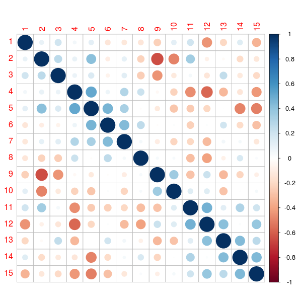
См. Gosh & Hendersen (2003) для более подробной информации о методологии.
Теперь, когда у нас есть ковариационная матрица, давайте сгенерируем набор данных,
> Score=-1+X[,1]/sd(X[,1])+X[,2]/sd(X[,2])+
+ 0.5*X[,3]/sd(X[,3])-0.25*X[,4]/sd(X[,4])
> P=exp(Score)/(1+exp(Score))
> Y=rbinom(n,size=1,prob=P)
> df=data.frame(Y,X)
> allX=paste("X",1:ncol(X),sep="")
> names(df)=c("Y",allX)
График переменной важности получается путем выращивания некоторых деревьев,
> require(randomForest)
> fit=randomForest(factor(Y)~., data=df)
Тогда мы можем использовать простые функции
> (VI_F=importance(fit))
    MeanDecreaseGini
X1          31.14309
X2          31.78810
X3          20.95285
X4          13.52398
X5          13.54137
X6          10.53621
X7          10.96553
X8          15.79248
X9          14.19013
X10         10.02330
X11         11.46241
X12         11.36008
X13         10.82368
X14         10.17462
X15         10.45530
который также можно получить с помощью
> library(caret)
> varImp(fit)
     Overall
X1  31.14309
X2  31.78810
X3  20.95285
X4  13.52398
X5  13.54137
X6  10.53621
X7  10.96553
X8  15.79248
X9  14.19013
X10 10.02330
X11 11.46241
X12 11.36008
X13 10.82368
X14 10.17462
X15 10.45530
Но популярный сюжет, который мы видим во всех отчетах, обычно
> varImpPlot(fit,type=2)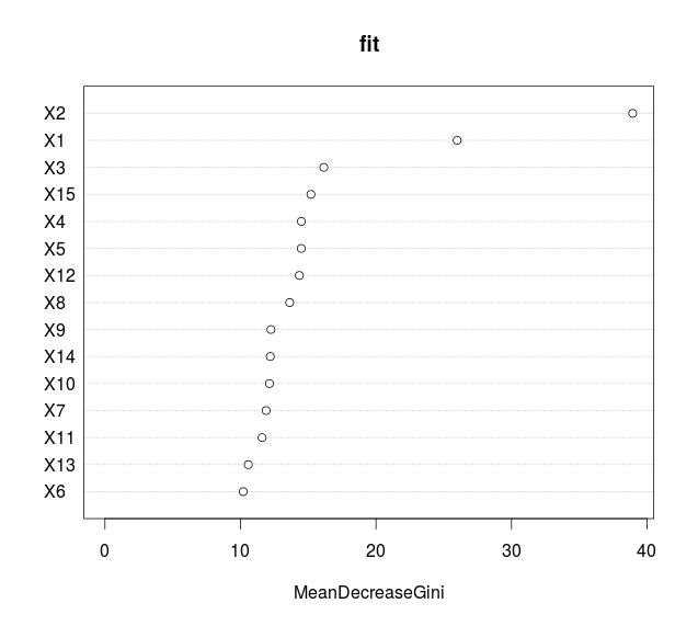
which represents the mean decrease in node impurity (and not the mean decrease in accuracy). One can also visualise Partial Response Plots, as suggested in Friedman (2001), in the context of boosting,
![http://latex.codecogs.com/gif.latex?x\mapsto\frac{1}{n}\sum_{i=1}\widehat{\mathbb{E}}[Y\vert%20X_k=x, \ boldsymbol {X} _ {я, -k} = \ boldsymbol {х} _ {я, -k}]](/wp-content/uploads/images/dzo/edc8313b02954df7ab82e160ff671fa7.latex)
> importanceOrder=order(-fit$importance)
> names=rownames(fit$importance)[importanceOrder][1:15]
> par(mfrow=c(5, 3), xpd=NA)
> for (name in names)
+   partialPlot(fit, df, eval(name), main=name, xlab=name,ylim=c(-.2,.9))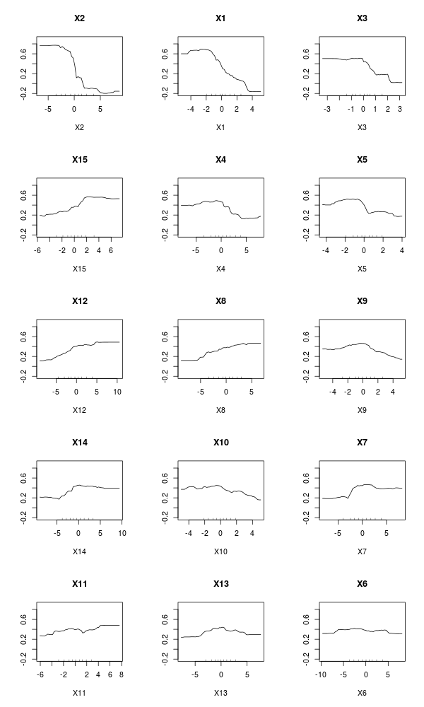
Those variable importance functions can be obtained on simple trees, not necessarily forests. As discussed in a previous post, given an impurity function  such as Gini index we split at some node t if the change in the index
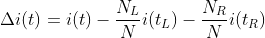
is significant, where tL is the node on the left, and tR the node on the right.
It is possible to evalute the importance of some variable Xk when predicting Y by adding up the weighted impurity decreases for all nodes t where Xk is used (averaged over all trees in the forest, but actually, we can use it on a single tree),
where the second sum is only on nodes t based on variable Xk. If i(.) is Gini index, then I(.) is called Mean Decrease Gini function.
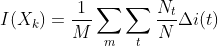
Consider a single tree, just to illustrate, as suggested in some old post on http://stats.stackexchange.com/
> library(rpart)
> fit=rpart(factor(Y)~., df)
> plot(fit)
> text(fit)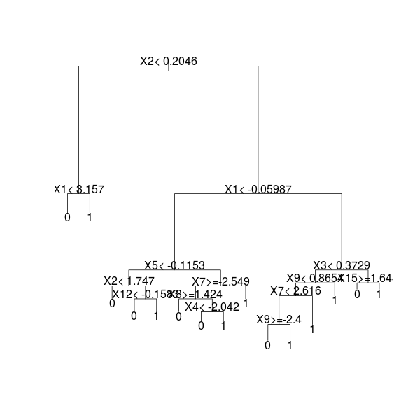
The idea is look at each node which variable was used to split, and to store it, and then to compute some average (see http://stats.stackexchange.com/)
> tmp=rownames(fit$splits)
> allVars=colnames(attributes(fit$terms)$factors)
> rownames(fit$splits)=1:nrow(fit$splits)
> splits=data.frame(fit$splits)
> splits$var=tmp
> splits$type=""
> frame=as.data.frame(fit$frame)
> index=0
> for(i in 1:nrow(frame)){
+   if(frame$var[i] != "<leaf>"){
+   index=index + 1
+   splits$type[index]="primary"
+   if(frame$ncompete[i] > 0){
+   for(j in 1:frame$ncompete[i]){
+   index=index + 1
+   splits$type[index]="competing"}}
+   if(frame$nsurrogate[i] > 0){
+   for(j in 1:frame$nsurrogate[i]){
+      index=index + 1
+      splits$type[index]="surrogate"}}}}
> splits$var=factor(as.character(splits$var))
> splits=subset(splits, type != "surrogate")
> out=aggregate(splits$improve,
+     list(Variable = splits$var),
+     sum, na.rm = TRUE)
> allVars=colnames(attributes(fit$terms)$factors)
>  if(!all(allVars %in% out$Variable)){
+   missingVars=allVars[!(allVars %in% out$Variable)]
+   zeros=data.frame(x = rep(0, length(missingVars)), Variable = missingVars)
+   out=rbind(out, zeros)}
> out2=data.frame(Overall = out$x)
> rownames(out2)=out$Variable
> out2
      Overall
X1  51.024692
X10  4.328443
X11 19.087255
X12 10.399549
X13 15.248933
X15  9.989834
X2  68.758329
X3  41.986055
X4  15.211913
X5  18.247668
X7  18.857998
X8  43.318540
X9  30.299429
X6   0.000000
X14  0.000000
This is the variable influence table we got on our original tree
> VI_T=out2
> barplot(unlist(VI_T/sum(VI_T)),names.arg=1:15)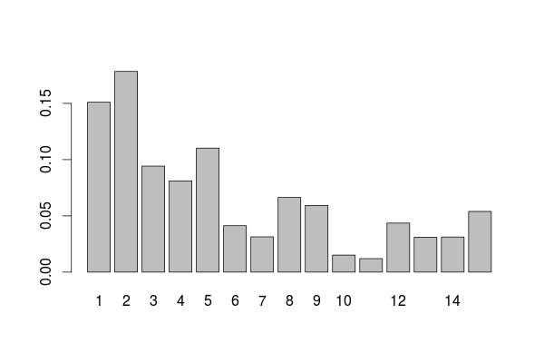
If we compare we the one on the forest, we get something rather similar
> barplot(t(VI_F/sum(VI_F)))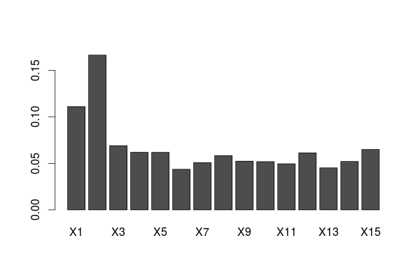
This graph is a great tool for variable selection, when we have a lot of variables. And we can get it on a single tree, if it is deep enough.